

17 Pro Tips For Creating A Successful Landing Page
Mybusiness Filings Latest Blog Post
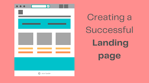
17 Pro Tips For Creating A Successful Landing Page
Your landing page might check all the basics. However, for it to be successful and rack up the conversions you need for your business, you have to switch things up.
This means moving from a ‘does it look good’ perspective to a ‘What do my prospects think about this?’ point of view.
And while there’s no clear manual for creating effective landing pages, there are common similarities between landing pages that drive results.
In this post, we’ll be looking at 17 of these instances and we’ll share them as tips you can use when optimizing your landing page conversion rate.
17 Tips for a Successful Landing Page
1. Use Color Psychology to Your Advantage
Every color elicits specific emotions from your users. Why do you think red is popular with stop signs and green connotes go? So, your landing page colors are way more important than you think.
You should ask yourself this important question – are the colors I’m using appropriate for my landing page? Do they convey the message I want them to?
- Think about what specific actions you want your users to carry out and choose the colors that’ll help you convey that better.
- Ensure that your text and background colors are complementary, not contrasting.
- Create several color mockups for your landing page and test which variation works best
In this landing page example from Oaks&Eden, you’d see how the text and background colors are complimentary. The colors are also calm and they blend in perfectly. No doubt any whiskey lover would immediately know what this page is about.

Did you know?  75% of the pencils sold in the US are yellow. |
2. Your Typography Matters More Than You Think
People tend to give fonts personalities and that’s why comic sans is generally seen as comical typography. So, the fonts you choose for your landing pages convey a tone. In addition to your marketing messaging, your typography matters because you need to ensure that it doesn’t take effort to read your content.
| Recommendation: As you know your landing page success also depends upon your business name. Want to create one cool and creative business name, why dont you check our business name generator. It will create more than thousand of cool and fun name ideas. |
Your font sizes are also just as important. Huge font sizes are seen as very important while smaller fonts are seen as less important.
- Stick to about four font sizes to avoid over cluttering your landing page
- Use the appropriate font type for your landing page – Sans serif and serif fonts are a good choice for landing pages
- Line spacing is usually dynamic. So test your typography spacing for web and mobile.
In our example from Doordash, you’d see less than four font sizes. Its typography isn’t overly serious but it isn’t so comical as well. The most important copy is in bigger font size and there’s enough space for readability across this page.

| Did you know? Over 200,000 fonts exist in the world. |
3. Optimize for Mobile Viewing
Today, people tend to get to landing pages on their mobile devices. So you’d want to ensure that your landing page on mobile converts as much or even more than your web version. It should be easy to navigate and that all your important information is visible in one glance.
For starters;
- Use single-column layouts – This makes it easy for mobile users to view every element on each page.
- If you do have a video you’d want to use, consider uploading a Youtube or Vimeo via embed
- Optimize your forms to reduce load time and ensure that the fields don’t automatically zoom in every time they tap on them.
See this example from Promo. Being a video software, they embed a video that loads super fast to drive their pitch. You’d also see that it’s a single-column layout and the CTA is above the fold.
| Did you know? As a mobile landing page loads from 1 to 10 seconds, the probability of users bouncing increases to 123%. |
4. Reduce the Distractions on Your Landing Page
If your landing page has a lot of pop-ups and ads attached to it, a user would typically look at it, right? These distractions only take your users away from your CTA. So it’s important to eliminate such distractors so your leads can focus on your offerings. A great way to do this is by;
- Removing your main navigation – Your links on the navigation menu can easily move your prospects away from the main action on the page.
- Take out moving images – Limit your visuals to static images and videos instead.
- Eliminating your distracting fonts and colors
This landing page below is a perfect blend of simplicity that focuses on a single action. There are no distracting fonts, moving images, or navigation to take you away from this page

| Did you know? Only 16% of landing pages don’t have a navigation bar. |
5. Those Social Share Buttons Need to Go
Many marketers argue that adding social media icons around your landing page increases the number of shares you’d get and maybe, that landing page will go viral. However, from this case study, we realized that taking out social share buttons increases conversions.
This is primarily because there’s only one CTA on the page and they were not distracted by whether or not they need to share this page with their friends. Funnily, social share buttons hurt social proof especially when there are figures in them.
If this landing page example below should ditch the social buttons on this page, they’d record more conversions. This is because the social proof here is negative due to the zero reactions it has gotten.

Instead of using social media buttons, you can;
- Use customer testimonials – prospects trust the word of mouth
- Use the number of customers you have especially if they are high
- Use your highly influential customers to drive trust
| Did you know? Kuno creative removed social media icons from their ebook landing page and raised conversions by 18%. |
6. Optimize Your Forms to Avoid Abandons
Designing forms for a successful landing page can be tricky, especially because if they are too long, your prospects are likely to abandon them.
On the other hand, if they are too short, you might not collect enough information to refer to them as leads. So you have to ensure it’s somewhere in the middle where it’s just right.
Here are a few tips to help you optimize your landing page forms
- Only ask questions that are relevant to qualifying your prospects as leads.
- Minimize typing by enabling auto-fill or radio buttons
- Validate data entry with a clear error messages
Here’s how Airbnb asks for the most important questions with this simple sign-up form;
| Did you know? After the 7th question on your landing page form, conversion rates start to significantly drop off. |
7. Tailor Your Landing Pages for Different Audiences
Depending on the nature of your campaign, having a universal landing page might not be as effective. This is because there are different factors surrounding different user segments.
There are location, language, demographic, and even differences in the user journey. How do you then make your landing pages relevant?
Creating dynamic landing pages is a great way to provide a personalized experience for every prospect. This will further lead to increased conversion rates from these pages. When creating dynamic tailored pages,
- Use location or IP addresses to provide relevant language, copy, and recommendations.
- Experiment with dynamic keywords and search terms
- Switch up CTA text for returning customers
An excellent example is Sabon. They had dynamic landing pages for their Black Friday campaign.
| Did you know? When you leverage customer data, you can record an 85% increase in sales growth? |
8. Prioritize Your above-the-fold Content
For landing pages that also double as a homepage, it’s important to keep the most important stuff above the folder. If your users are on a mobile device, you’d need to convey all your offerings within that landing page. And so here are a few things we recommend leaving in this section
- Your headline and subtext should be persuasive, eye catching, and convey all your user needs to know
- Your CTA needs to remain above the fold
- Use additional media like video and images to pitch more benefits
In our example, Mint does an excellent job of clearly conveying its services and adding relevant buttons to this section. As a prospect, you can find out all about the app, and download it without scrolling any further.
Did you know that the average above-the-fold line is approximately 1,000 pixels wide and 600 pixels tall?
9. Remove Skepticism with Trust Symbols
Since your landing pages are the first contact a prospect may have with your brand, chances are, they are already judging it.
However, when you add certain elements to help you build trust, you are likely to increase the conversions you record from this page. A great way to start is by;
- Using trust icons across this page like excellent reviews from third-party sites
- Ensure your message is consistent in the brand, tone, and content
- Don’t ask for too much information in your contact form
Here’s how Housekeep uses trust symbols from Trustpilot to subtly reinforce trust on this landing page.

| Did you know? 94% of users never trust an outdated website. |
10. Set Up Call Links
Let’s face it- not a lot of people will fill out your landing page forms. So you need to create an avenue where interested prospects can easily reach out to you. This is where your call links come in.
Call links are links that automatically dial a phone number when you click on them. They are common on mobile landing pages.
Using call links is beneficial because you can directly pitch your product or service to prospects and shorten the life cycle. When setting up your click-to-call landing pages, ensure that;
- There’s enough negative space between your text and the CTA
- Avoid using multiple CTAs on this page
- Ensure that this call CTA is placed on the sticky part of your screen
See how Vivint smart home uses a call CTA on their landing page

| Did you know? A click-to-call functionality increases ROI by an average of 143% |
11. Provide an Enticing Offer
At the end of the day, if your offer isn’t enticing, no matter how fancy your designs are or how simple your pages are optimized, no prospect will be willing to convert.
You typically have 8 seconds to convince your users that your offer is legitimate and useful to them. This is why it’s important to provide a very attractive offer on your landing page.
- Conduct market research and offer what your customers really want
- Broadcast your benefits and offer with your landing page header.
- Don’t talk about yourself and your product – focus on the benefits
There are less than 20 words on this entire landing page and it just dives straight into the benefits. Any prospect from MeetEdgar knows that they’d be saving time and leaving the tough work to this service.

| Did you know? Customers are willing to pay a premium price of up to 13% by simply getting a good customer experience? So make an enticing offer and provide a good experience while at it. |
12. Use Powerful Visuals for Complex Products
In the case where you have a complex product where text might not compel your prospects enough, use high visuals to complete your nudge.
We are in an era where people consume a lot of videos and so this might be your best chance at converting them. However, before slapping on a video on your landing page;
- Choose between an explainer or testimonial video for your landing page
- Use directional cues in the video to lead prospects back to the CTA
- Optimize for mobile and load time
The outskirts press embeds a Youtube video to drive more conversions on this landing page.
| Did you know? Conversions increase by 86% when a video is present on a landing page. |
13. Rewrite your CTA for a More Actionable Effect
Ditch the regular CTA’s like Learn More, Submit, Get Started Now, and so on. Your CTA has to match your offer and reinforce some sort of urgency or scarcity. You can also restate what the benefit is in that button that way you can set expectations and encourage your prospects to click on it.
Your CTAs are also dependent on where your prospects are in the user journey. You shouldn’t use a ‘Buy Now’ CTA for someone who is clearly at the top of your sales funnel.
In this case, leading them to more information is warming them up for conversion. You also can’t share a resource with someone who is at the bottom of the funnel because, at that point, they are ready to make that purchase.
- Identify the stages in the user journey and rewrite your CTA based on where your leads are at this point
- Use first and second-person pronouns like ‘My’, and ‘Your’
- Keep your CTA button design simple
In the landing page example below, you can see how the CTA is simple yet contrasting with other elements. At this point, you can deduce that this landing page is for a user on top of the sales funnel. They also use ‘Your’ which makes the CTA actionable and clear.

| Did you know? Hyperlinks and texts do not qualify as a CTA? A CTA is always a button. |
14. Ditch the Marketing Buzzwords
So far we’ve talked about stating the value and benefits of your marketing. However, it is important that your benefits are super clear and this means ditching the marketing buzzwords.
You need to use the voice of your customers. When they request assistance, what voice and tone do they use? Your landing page copy has to address their pain points, preferences, expectations, and aversions in their own words.
- Conduct surveys and customer interviews to get the right voice
- Use action verbs and power words in your copy to address their concerns
- Use dynamic landing pages to find the right fit
On the landing page, Lyft uses simple terms and addresses what most drivers want to know by using the power words ‘Earn More’
| Did you know? The voice of customer users experienced a 55% increase in their customer retention rates. |
15. Follow Up with a Thank You Page
Your sales cycle should immediately start after the customer completes the action. By leaving the thank you page blank, the entire process might seem underwhelming or not so satisfying.
If your landing page is only requesting emails, you need to find other ways to lead your prospects to your website.
- Provide other additional resources like blog posts
- Upsell by suggesting related products and guides up for download
- Show off your social media links
For example, Tidio redirects its leads to the website after downloading a guidebook.
| Did you know? Your thank you page can raise your overall website conversion rate by 10%. |
16. Test your Landing Pages
The only way you’re going to know what works from what doesn’t is when you test your landing pages.
If they are running ads, you’d be spending a ton of ad credit and it’ll be a waste of resources if you can’t tell what drives the most conversions on your page. What combinations work?
- While optimizing, run split tests to see if your conversions are increasing or reducing
- Turn on your conversion tracker so you’re notified if anything changes across your pages
- Don’t ever stop testing- even when the results are excellent, you can always optimize for better.
| Did you know? Only 60% of businesses run A/B tests on their landing pages. |
17. Match Your Landing Pages with Your Ads
While this might seem like common advice, many marketers make the horrible mistake of sending their leads from an ad to their homepage or a generic splash page. This leaves the ad prospect confused and they’ll have higher bounce rates. So what you can do is
- Design a landing page that matches your Ad – the colors and design should be consistent for visual continuity
- The copy on both pages should have the consistent offerings
- Your Ad CTA should match the exact landing page you’re taking them to.
In the Facebook ad by Five Four, there’s a 50% discount that nudges prospects into signing up and placing an order.
Once you click on the CTA you land on the page. The navigation banner references the 50% discount, the colors are the same and there’s just visual continuity on this landing page.
| Did you know? 32% of people say that ads influence how they see themselves. |
What’s Next?
Use these tips listed above to improve your landing page conversions. While you can use as many as you’d like, remember to always test the changes you make. This way you can know what works for your product and what doesn’t.
Your landing page might check all the basics. However, for it to be successful and rack up the conversions you need for your business, you have to switch things up.
Comments :